Colors are an important aspect of map-making. There is a wide spectrum of uses (and colors!) that can be found in the map collection at the Norman B. Leventhal Map and Education Center at the Boston Public Library. Color is used for everything from conveying very basic information, such as the difference between land and water, to designating boundaries (parcels, towns, states, countries, etc.), to using colors as a representation of data, and even using colors to influence a viewers emotions and opinion.
As part of the #30DayMapChallenge on Twitter and Instagram, we have gone through our collection to find some interesting colorful maps to share! Can you figure out how each of these maps use color to convey information?
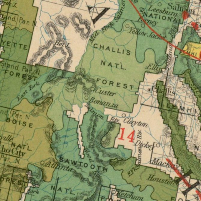
Green: National Forest Boundaries
This detailed map showcases national forests in a large spectrum of greens. Rather than use one shade of green to indicate all forests, or using multiple colors to show the different boundaries, this cartographer chose to use many different shades of green, creating a beautiful collage of forests. The cropped part pictured here is a detailed look at some of the lands that were designated as national forests in Idaho in 1910. Many of these were combined and now make up the seven national forests that are currently in Idaho. They cover approximately 40% of the state (over 20 million acres!).
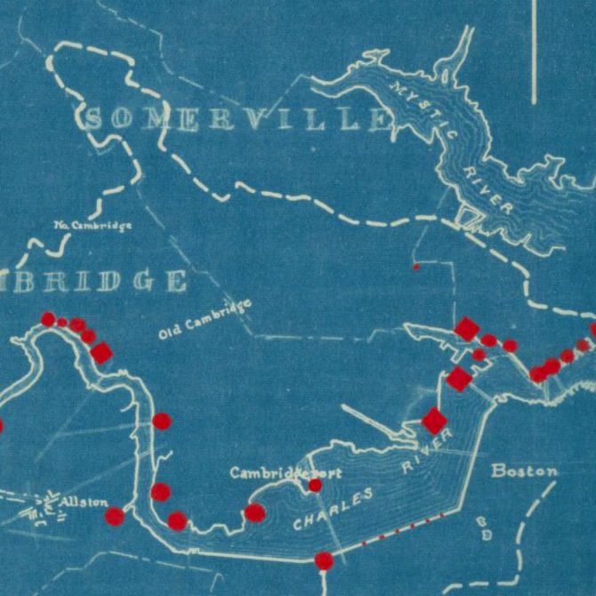
Blue: Blueprint
What better map for the “Blue” challenge than a blueprint?! This 1892 blueprint map was made by the Boston Engineering Department. This document was used to show sources of pollution on the Charles River (marked in red) with grades from “Serious” to “Abominable Nuisance.” Which is the more important color in this map, blue or red?
Even though the current color of the Charles River might not be a crystal clear blue, a concerted cleanup effort of the River has led to an “A-minus” rating by the Environmental Protection Agency. Plans for a swimming venue on the Charles are underway and we look forward to that development!
Red: Election Map
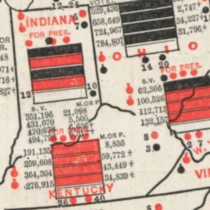
Who says the GOP owns red? While in modern political maps, red is primarily used to represent the Republican party, in this 1888 Political map of the United States and Territories, red is used to show a Democratic party majority.
Since the late 19th century, map makers have experimented with many graphic techniques for displaying Presidential election results. This map is one of the earliest and most complex attempts. It was published in anticipation of the 1888 election between Republican Benjamin Harrison and Democrat Grover Cleveland.
The stack of bars in each state each represent a prior election year (1872, 1876, 1880, 1884, and 1888). Each is colored to show which party held the presidential majority (black for Republican, red for Democratic). The last bar in each state represents 1888, the year the map was published, and the legend suggests that the owner can fill in each bar with the correct color once the returns are completed.
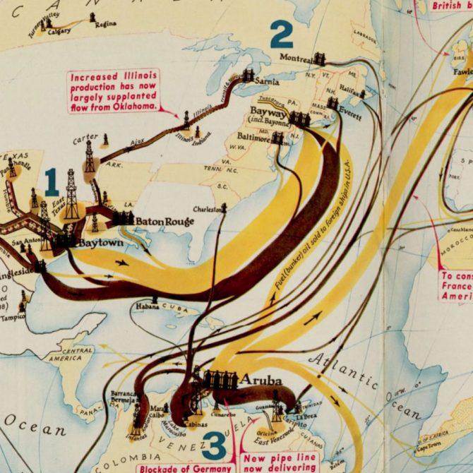
Yellow: Infographic
Thick and thin yellow flow lines are a prominent feature on this map from 1940. Flow lines from the oil fields of Texas and Venezuela and the refineries in Aruba show the movement of crude oil (dark brown) and refined oil (yellow) by pipeline or tanker to the East coast of the U.S., Europe, and other parts of the world. Color choices for infographics can influence how viewers interpret the data. How does the brown color make you feel versus the yellow? Why do you think the artist chose these colors?
Can you find more colorful maps in our collections? If you have a favorite, tell us about it! If you enjoyed these maps, follow us on Instagram to see the rest of the maps from the #30DayMapChallenge as well as regular posts from our collection of historic maps.


Add a comment to: Mapping in Color